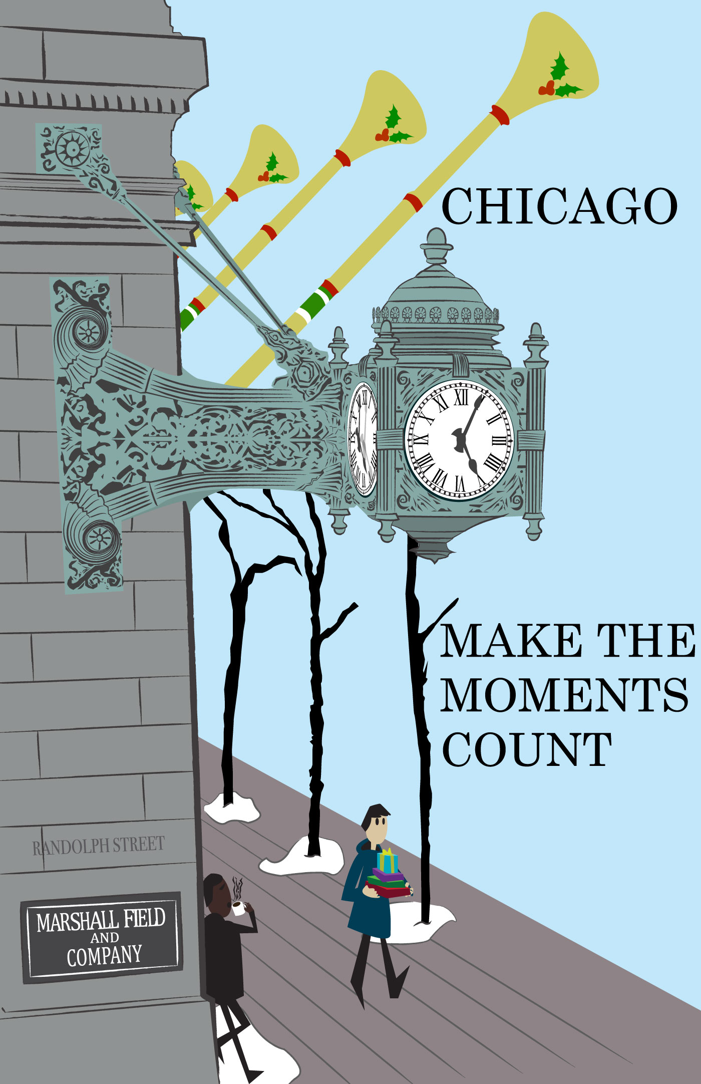
The project’s guidelines were to make a travel poster for a physical or fictional location, and the illustration needs to be done in illustrator. I based my projects on a hanging clock that rested on the Macy’s department store after it was converted from Marshall Field and Company. The original reference was taken from a photo I’ve taken on the 2nd floor of the Walgreens in State Street. With illustrator, I’ve used the pen tool to trace over to create a silhouette of a part of the clock, for it to be covered in shapes and strokes created with the pen tool. Areas of the clock that were in the background use a darker shade, and shadows use a much darker tone. These needed changes in tone are used to indicate where the objects are located and affected by lighting in the scene. It's a small aspect in the piece that's able to show this cut out art style being able to replicate lighting that could be like real life. The underwhelming aspect of this piece is the detail of the arm. Without tracing the spirals and strokes of the pattern, it left out potential depth into the original pattern design; making it flat. Another critique that could’ve been made is prohibiting the typography from touching the edge to look cleaner and more formatted for the printed result. Overall, this piece was a great practice as my first complete project for illustrator that shows my skills in vector drawing and depicting depth of fields.